
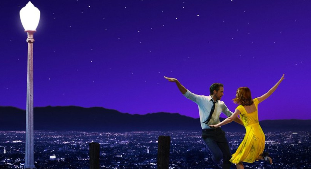
La La Land is an absolute gem of a movie. Though it didn’t win the top prize at the Oscars (Moonlight was also great), it was the most memorable cinematic experience of the year for me. The visuals, the music, the acting: all 10s in my book. Watching the movie for the first time, what struck me the most was how vivid the colors on the screen were, and how different scenes in the movie were accompanied with distinct colors as if they were deliberately paired. Is there a synchronized dance between seasons and colors?
With the movie presented as a narrative of five chapters - Winter, Spring, Summer, Fall, and Winter 5 years later - my hypothesis is that distinct colors are matched with the five chapters. Is there a synchronized dance between seasons and colors? Using some basic video processing and unsupervised learning, my aim is to visualize how the dominant colors of the movie frames change throughout the running time.
I was able to decompose the movie into a flat range of colors, where dominant colors go from top to bottom and time runs from left to right. Here’s the finished product:
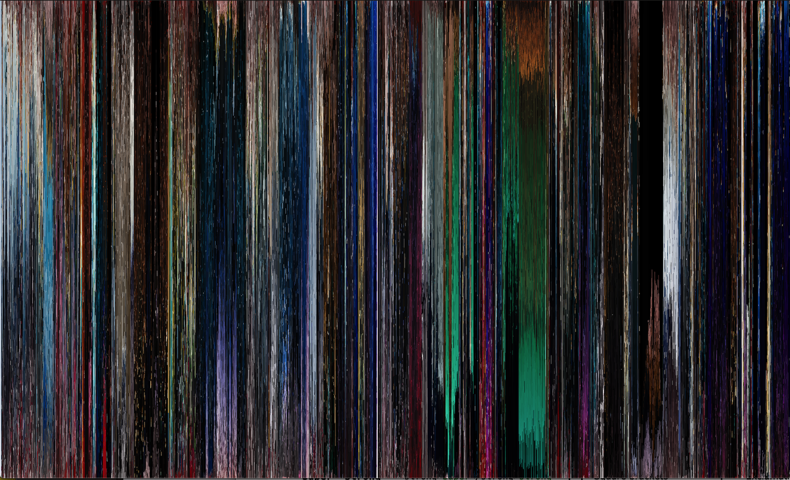
Apart from being really pretty, the resulting image could help us put a correspondence between colors and movie scenes (and correspondingly, emotions). Let’s do just that.
Dissecting the Color Spectrum
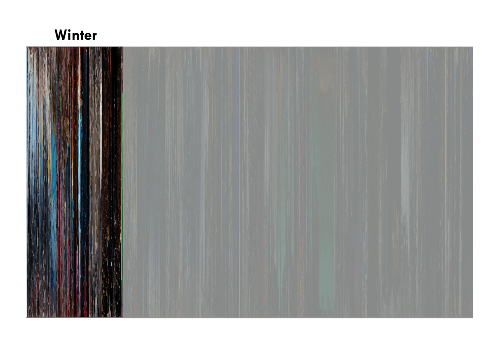
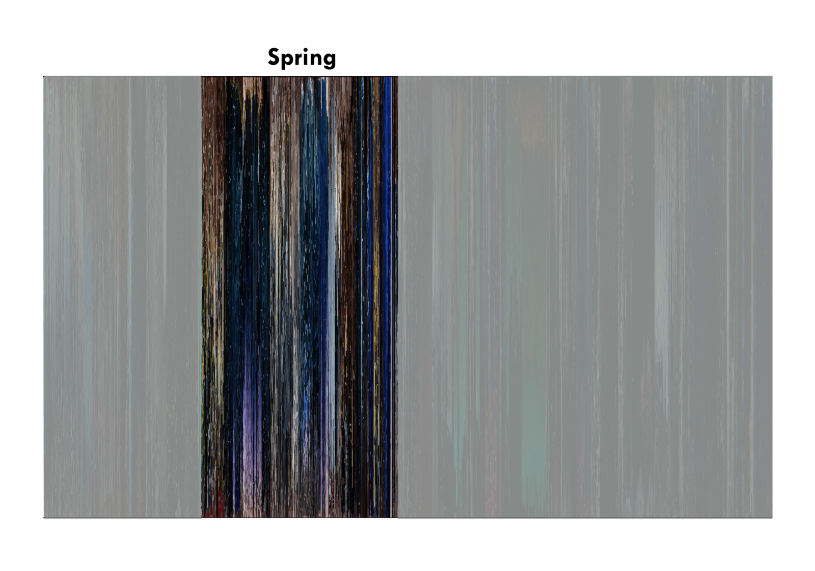
Winter
Start: Another Day of Sun.
End: Mia’s audition: “No, Jamal. You be trippin’.”
Major events in winter are the opening number Another Day of Sun and Mia and Seb’s second interaction, right after Seb gets fired from his piano gig. These two events are the most apparent in the color spectrum. Bright colors dominate the beginning of winter, particularly hues of blue. Midway, red takes some share of the spotlight, and then dark colors close it out.
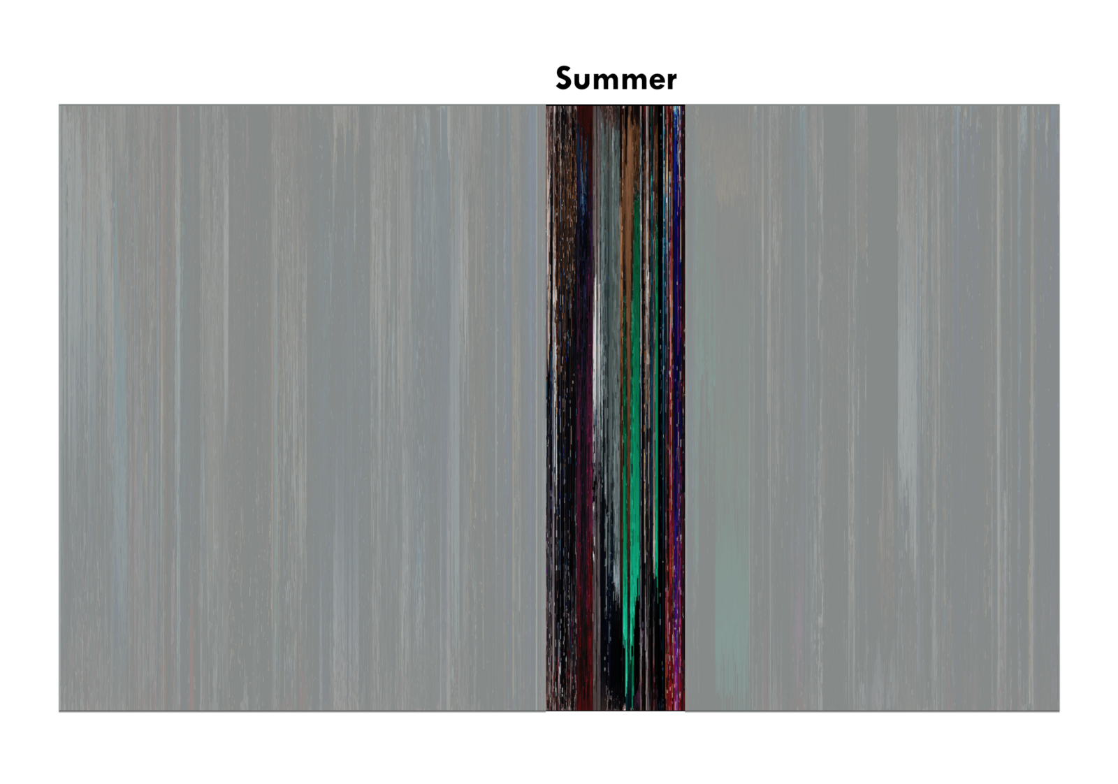
Spring
Start: Seb gigs in an 80s cover band at a pool party.

End: Kiss at the Griffith Observatory.
Mia and Seb’s relationship blossomed in spring. From initial annoyance to the first kiss, spring goes through the motions of a love story’s beginning. Notice how spring is dominated by the color purple, a personification of love, particularly during A Lovely Night and Planetarium.
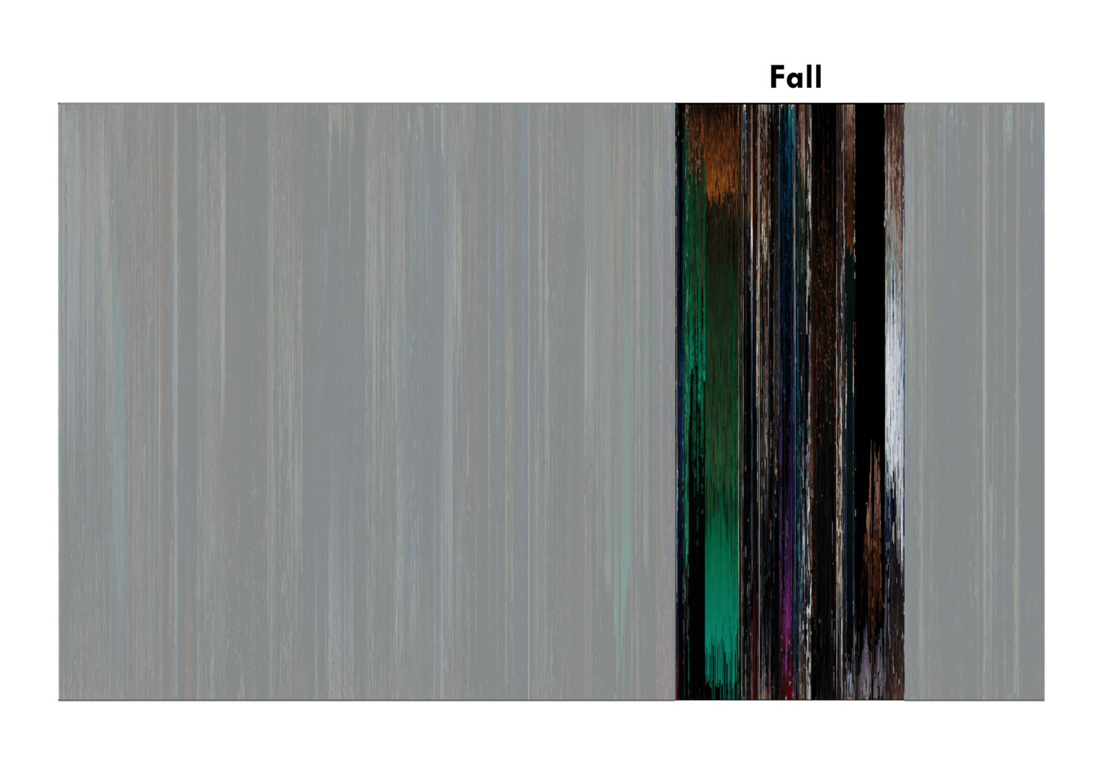
Summer
Start: Mia starts writing her one-woman show.

End: Seb’s concert.
Summer is the shortest season in the movie. It starts out with red, turns to green, then closes out with a fight between red and blue during Start a Fire. According to Film School Rejects, red, blue and green are said to represent reality, control and a change, respectively. The green during summer corresponds to City of Stars, which preludes the eventual fall-out of Mia and Seb.
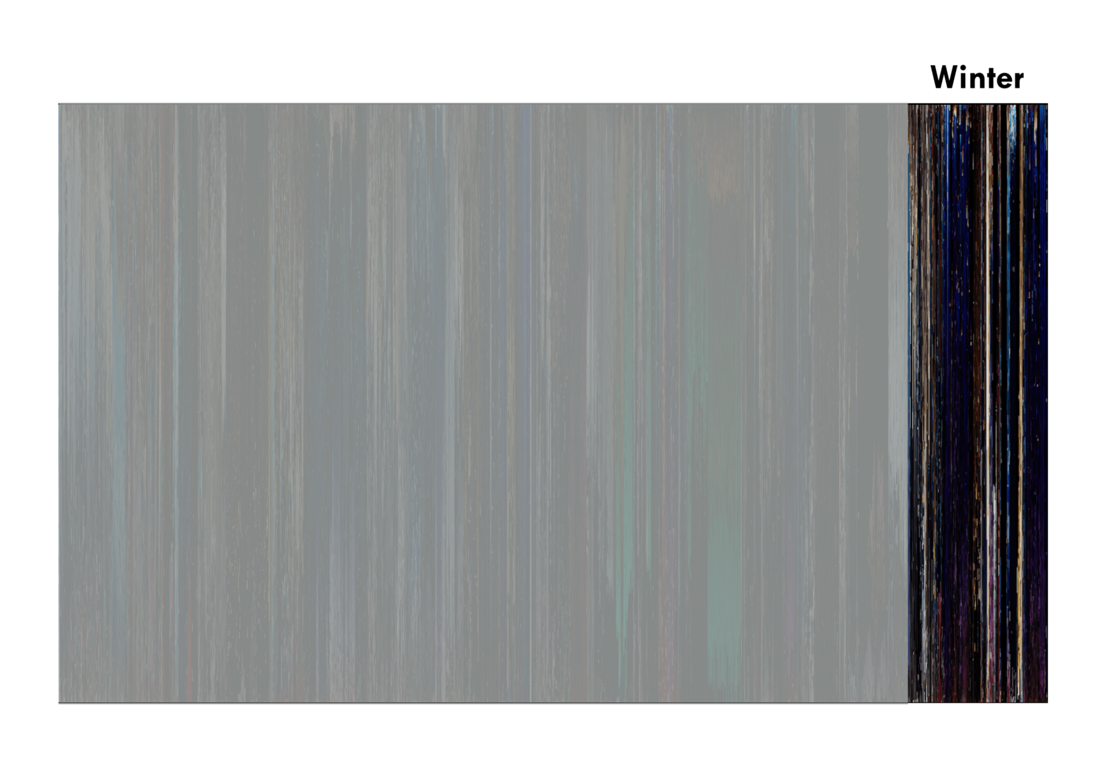
Fall
Start: Mia sends invites to her one-woman show.
:format(webp)/cdn.vox-cdn.com/uploads/chorus_image/image/52590759/Screen_Shot_2017_01_03_at_3.42.59_PM.0.png)
End: Mia and Seb break up.
Green bleeds into fall from summer, coinciding with Mia and Seb’s fight. After green fades, we see that the bright colors also die out, leaving only black and white, i.e. Audition.
Winter (5 years later)
Start: Mia walks into coffee shop.

End: Mia and Seb smile at each other.
Winter, 5 years later, is almost devoid of bright colors. The only tinge of brightness we see is in Epilogue, a fantasy of the what-ifs in Mia and Seb’s story. Notice also the blue tinges throughout winter. As mentioned earlier, blue represents control. At this point, Mia and Seb were finally able to achieve their goals at the expense of not ending up with each other.
From Video to Color Spectrum
How did I produce the color spectrum?
In this section, I discuss the methodology to go from video file to color spectrum.
Given a video file of La La Land, what we want to visualize in one image is how the colors of La La Land change over time, a color spectrum over time.
Sampling Frames
A video is simply a sequence of images. In order to obtain color samples, we can simply export frames from the video and do an analysis on those frames. I exported a frame from the movie every two seconds using VLC. In total, 3,020 movie frames were used in the analysis.
From Frame to Color Strip
Given a single frame of the movie, what we want to do is obtain a distribution of the constituting colors and turn it into a color strip. If we do this to all frames in the movie, we can stitch all of these together and obtain a color spectrum.
The following chart shows the procedure to go from a movie frame to a color strip.
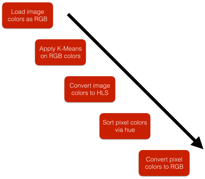
Loading and Clustering
The first thing we have to do is to load the movie frame into Python. We can do this using the Python Image Library (PIL). After converting the frame into a PIL Image object, we obtain an array of the RGB (Red, Green, Blue) constituency of all the pixels in the image.
# file points to an image frame in the local filesystem
im = Image.open(file)
pixels = im.getdata()
vals = np.array(pixels)/255.
The next thing we do is to apply a clustering algorithm in order to reduce the RGB color space of the frame into a smaller set of colors. In this case, we use Scikit-Learn’s implementation of the Minibatch K-Means algorithm and reduce the image to 50 colors. The reduced set of colors can be obtained as the centers of the resulting clusters.
algo = MiniBatchKMeans(n_clusters=50, random_state=0).fit(vals)
hls_centers = []
for i in range(len(algo.cluster_centers_)):
    rgb_center = (algo.cluster_centers_[i][0], algo.cluster_centers_[i][1], algo.cluster_centers_[i][2])
    hls_centers.append(tuple((np.array(colorsys.rgb_to_hls(*rgb_center)))))
I provide a quick primer on the K-Means algorithm at the end of the blog post if you’re interested to learn more about its inner workings.
… You may be thinking, why go through all the effort?
The colors in the color strip of each movie frame have to be sorted because we want to have continuity and consistency across color strips - so that colors from one color strip to the next flow nicely. The problem is, there is no trivial way to sort colors. Color is a 3-dimensional quantity, whereas sorting is a 1-dimensional problem. If we sort the raw RGB colors alone, we get a very noisy and unnatural sorting. However, if we compress the color space to a small set of colors, say 50 colors, we are able to reduce noise and have some consistency.
RGB to HLS and Color Sorting
After reducing the color space to a set of 50 colors, we change color representation from RGB to HLS (Hue, Luminosity, Saturation).
Why? Because we want to sort the colors on hue, which seems to be the best option for what want to do. There are a lot of possible ways to sort colors, but simple RGB sorting doesn’t really work well. You can read more about sorting colors in Alan Zucconi’s wonderful article.
hls = list(map(lambda x: tuple(hls_centers[x]), algo.predict(vals)))
hls.sort()
HLS to RGB and Saving
We convert back to RGB and build a histogram of the colors in the frame. Lastly, we make an Image object out of the color strip and save it as a png file.
rgb = list(map(lambda x: tuple((np.array(colorsys.hls_to_rgb(*x))*255).astype(int)), vals))
Color Dynamics: Strip to Spectrum
Now that we know how to process each movie frame, we can repeat the process for each movie frame. Doing so, we get a huge set of color strips. To stitch the color strips together, we can simply use PIL’s paste method. And boom, we get the color spectrum.
If you’re interested to see the full code, you can check out my Jupyter notebook.
K-Means Clustering Explained
Proceed if you’re interested to understand how the K-Means clustering algorithm works.
The Algorithm
Clustering is not a difficult concept to grasp. Basically, when you cluster a group of objects, you’re dividing them into a set of subgroups wherein each subgroup’s members are close to one another according to some measure.
One of the most basic ways we can perform clustering is the K Means Clustering algorithm.
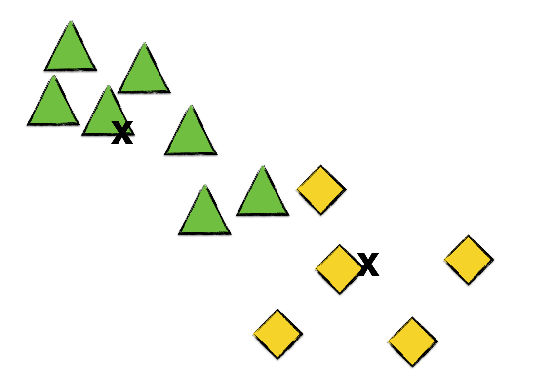
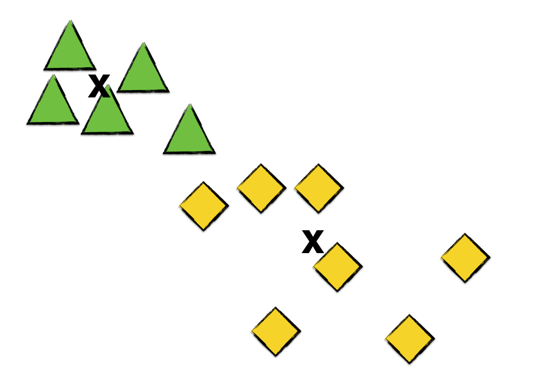
Imagine you’ve got a set of points, and you want to cluster them into K=2 groups.
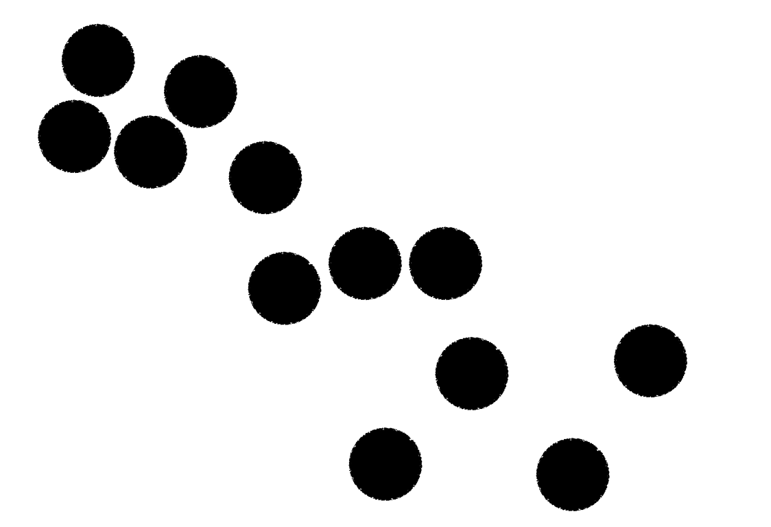
The first thing you’ve gotta do is to pick K=2 points at random. These two points will serve as the initial centroids for the two clusters. More on centroids later. Let’s represent our two clusters by green triangle and yellow diamonds. Suppose we pick the following two points as the initial centroids of our clusters.
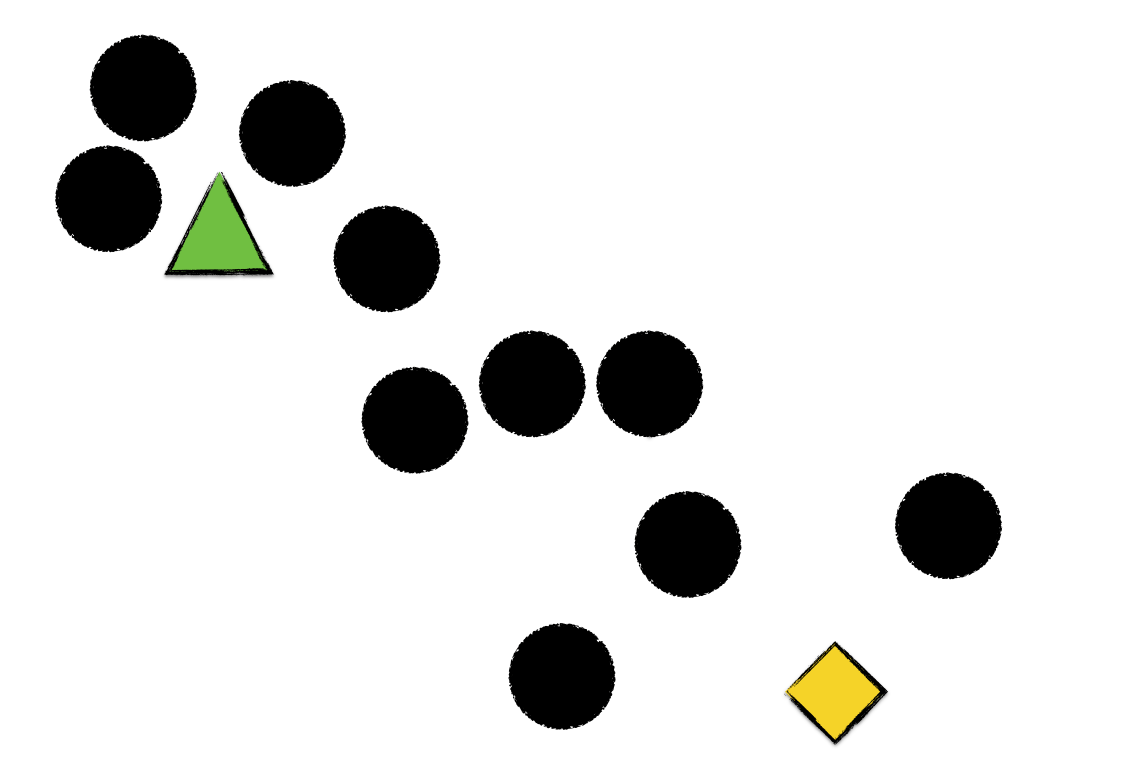
Next, we go over every point and assign each to the cluster of the centroid it is nearest to.
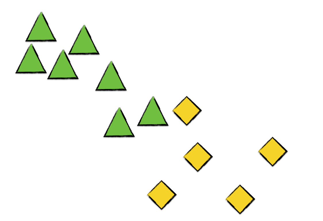
As we can see, every point now belongs to a cluster. The next thing we do is to calculate the centroid of each cluster. (That’s why it’s called the K means algorithm.) Let’s label the succeeding cluster centroids by x marks.
As before, we go over each point and assign each to the cluster whose centroid it is nearest to.
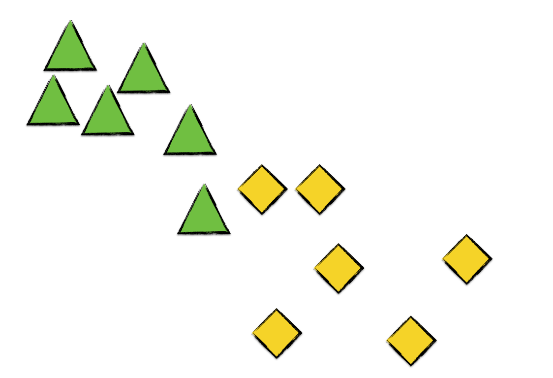
We see here that one of the green triangles becomes a yellow diamond since it’s nearer to the yellow diamonds’ centroid than to the green triangles’.
We then repeat the process of
- calculating the centroid of each cluster, and
- assigning each point to the cluster whose centroid it is nearest to,
until a stopping condition is satisfied. We could check if no point changes cluster in the next iteration or if the average inter-cluster error changes only very slightly.
In a nutshell, that’s the K Means Clustering algorithm.
If we continue our example and compute the next centroids,
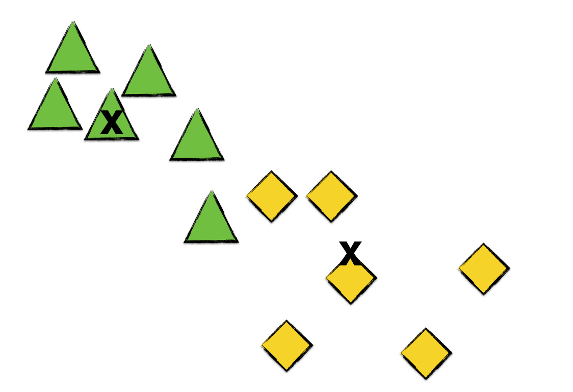
Going over each point and assigning clusters,
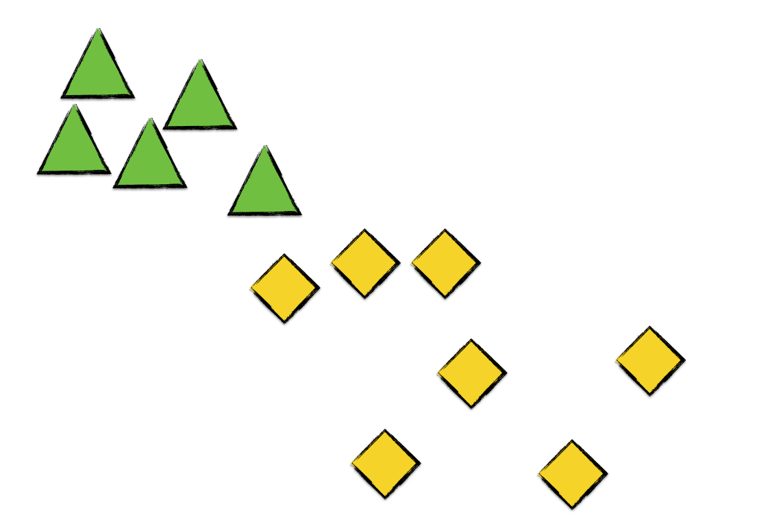
Again, a green triangle converts to a yellow diamond. Now, calculating the centroids,
We see that no point transfers cluster in this iteration. Thus, we halt the K means clustering algorithm and consider the resulting clusters as final.
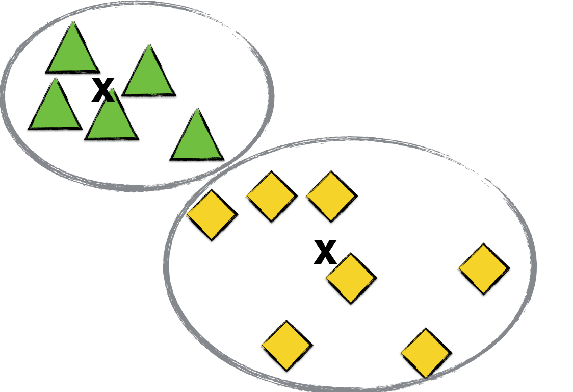
Image Compression
An interesting application of the K Means Clustering algorithm is image compression. Suppose that you have a slightly-too-big image and you want to reduce its file size. How can you do it?
One way to do this is to reduce the set of colors in the image. A color of a pixel is usually stored as a tuple of 3 integers — RGB — which describes the pixel’s relative levels of Red, Green, and Blue. Levels can be go from 0 to 255.
Since each pixel stores 3 integers to describe color, there could possibly be a large set of colors in a single image. In theory, there are actually 16,777,216 possible color choices for a pixel. Thus, a highly colorful image holds a ton of data.
By applying the K Means Clustering algorithm on the RGB color space of an image, we can reduce its size by picking a set of K representative colors (a.k.a. the centroids) to describe the color space of the whole image. Specifically, we replace each pixel’s color by the centroid that it is closest to. By reducing the set of colors to K, we are, in effect, introducing error in our compression, and so color compression is not a lossless type of compression.
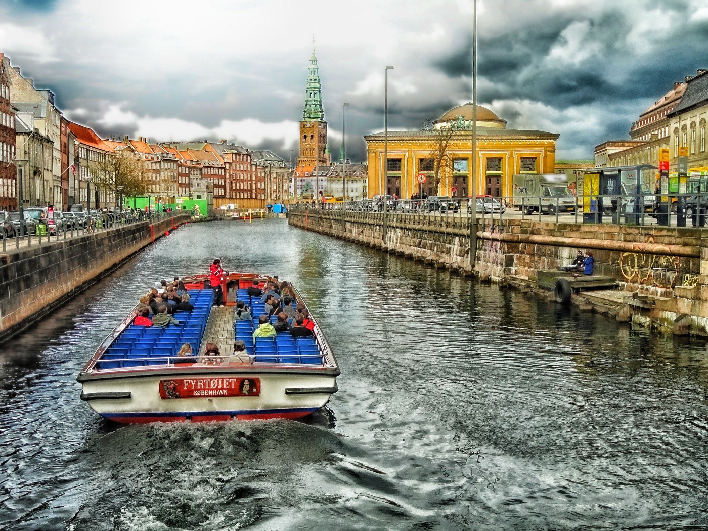
As an example, we can apply K Means Clustering algorithm to the following image of Copenhagen:
If we choose 10 colors,
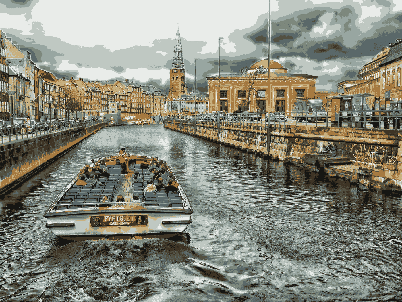
or 40 colors,
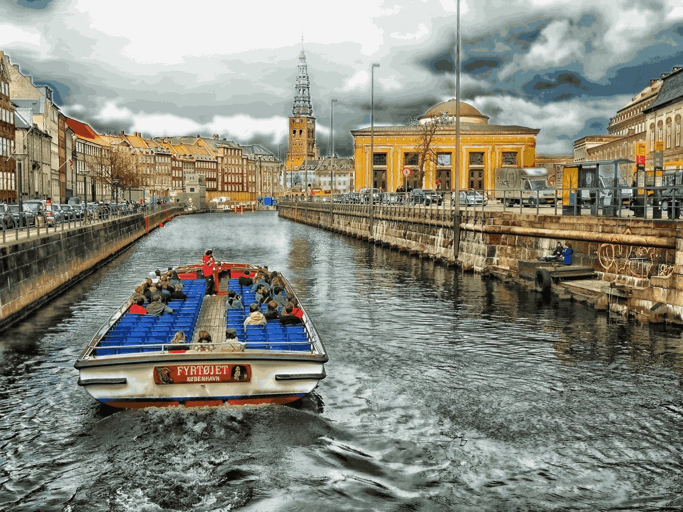
The larger the K we select, the closer the colors of our compressed image are to those in the original image. On the other hand, the smaller K is, the smaller the image’s file size. For K=5, the image’s size is 679 KB, while for K=40, it is 2.1 MB. So we can see that there’s a trade-off between color accuracy and file size.
The K Means Clustering algorithm is a ridiculously simple but powerful machine learning tool that has found great application in a myriad of domains. As we saw in our example, clustering can be used to reduce the color space of an image to a set of K colors.